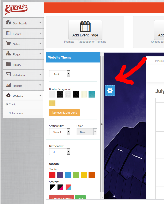
Basic theme settings are controlled by the editor accessible when you are on the View tab in a Page, Event or Product, or when you are viewing your website on the Stage URL.

Important files for your theme are controlled from the Admin interface under Website > Config > {your website} > Theme Files
In addition to these settings you can make detailed customisations by editing the source LESS files. Once you then recompile these, you will have a new single CSS file that can be uploaded – also through the Website > Config > {your website} > Theme Files tab. Use the Custom CSS option to choose the file.
Understanding our CSS
Our templates are compiled using LESS. This makes it easier to make global changes and reduces the number and size of the final files. You can find out more about LESS here.
LESS is used only for development. Start by downloading our standard CSS and LESS files here.
All variables used can be found within the /less/variables folder in the CSS style ZIP. You will find many files in there. They contain variables values for each color for the predefined styles (ex: blue, red, dark), but the structure is all the same.
Main colors and backgrounds
There are 4 important colors used in the template for components, buttons and so on: base, alternative base, light and dark.
Each color is represented by a class (base, base-alt, light, dark) which can be applied on many HTML components to change backgrounds.
In the next table we will include all the background color variables:
| Variable name | Description | Class name |
|---|---|---|
| bgBase | The base color of the website (ex: blue) | .base |
| cBaseContrast | The color used on bgBase backgrounds | |
| bgAlt | The alternative base color (ex: green) | .base-alt |
| cAltContrast | The color used on bgAlt backgrounds | |
| bgLight | The light color (ex: gray) | .light |
| cLightContrast | The color used on bgLight backgrounds | |
| bgDark | The dark color (ex: black). | .dark |
| cDarkContrast | The color used on bgDark backgrounds | |
| bgLightGray | The lighter color used for alternating section backgrounds. | .light-gray |
| cLightGrayContrast | The color used on bgLightGray backgrounds | |
| layoutBg | The main layout background color applied on the whole body element | N/A |
| headerBg | Used for the main header when available. See header 3 example from the style builder. | N/A |
| footerBg | The main footer background color. | N/A |
| footerBg | The main footer background color. | N/A |
There are many more color variables included. These are only the important ones. You can find them in the "Advanced customization" area from variables.less file.
Customize template and compile LESS files
Step by step instructions follow. We suggest you stick to them closely if you’re not familiar with LESS.
Important files from the less folder:
| File name | Description |
|---|---|
| global-style.less | Containes all the imports and responsive media queries. This unifies all the needed styles in a single file (global-style.css) |
| theme.less | This is the place where all the styles cand be found, except buttons and shortcodes |
| buttons.less | All the buttons classes cand be found within this file |
| shortcodes.less | We used this file to customize some of the Bootstrap components styles |
| variables.less | The place where all the variables can be found |
Tools needed:
- Code editor: We recomment Sublime Text 3, but any other text editor should work just fine. Download it here
- LESS compiler: We recomment Koala App. Download it here
Other info
The important folders you will work with are less and css. LESS folder containes all the variables and styles, while CSS containes only the unified and compiled version of less files in css format.
In less -> variables you will find many files. You will only use variables.less. The other files are used for each pre-defined styles.
The variable file is formed from 2 sections: Easy customization (we have included all the important variables so you can easily change their values) and Advanced customization (we have included all the variables that we considered that won't be modified so often).
That's all. Now let's get to the customization part:
Customize and compile
- Open Koala App and include the folder you expanded the ZIP into. Seek the global-style.less and open it. When you press "Compile", it automatically creates a css folder and puts the compiled file with the same name and .css extension. After that, as long as you keep the Koala App opened in this state and have the "Auto Compile" option checked it will re-compile this file each time you make modifications in it or a dependency file and save it. So that's a really cool feature if you don't want to create a LESS enviornment for this. For those who want to work with LESS files in their project we will explain more in depth in a separate section.
- Open your chosen text editor.
- Open variables.less. You will see that each category of variables (backgrounds, colors, header, layout etc) is very well delimited and commented so you can easily figure out what are they doing.
- Now, this is the part where you will play and create you own design. Change colors, background, fonts (choose any font from Google Fonts library and import it within this file), border radiuses, navbar etc.
- After you are done, save all the files. If the global-styles is not already compiled, go in Koala App and compile it. We recommend before compiling to select from Output Style the "Compress" option. It will compress the css file reducing the load time considerably.
- Finally, you should upload your new CSS file to the Website from the Website > Config > Theme tab.
Base Colour
The simplest level of customisation is to change the base colour.
- Open less > variables > variables.less
- Copy and pase all the contents from one of the example files (eg: variables-red.less)
- Replace the @bgBase variable value with the color you want (HEX or RGB/RGBA)
- Follow the same steps from "Customize/compile LESS files"
Boxed or Fluid
The presence of a background image in the Website > Config settings or the selection of a preset background will cause the body-boxed class to be added to the main page wrapper DIV.
<div class="body-wrap body-boxed"> ... </div>
Navbar customization
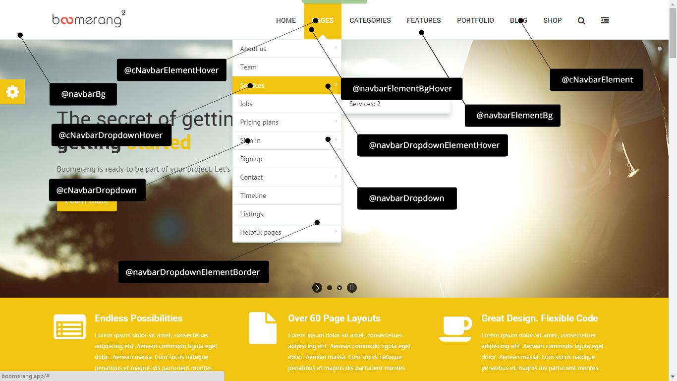
To change navbar background color, text color, fonts, sizes you will need to open variables.less again an change the variable from the table below. After you are done, follow the steps from "Customize/compile LESS files".

Variable name – Description
navbarBg – The main navbar wrapper background
navbarElementBg – The navbar element background
navbarElementBgHover – The navbar element background on hover
navbarElementBorderColor – We used this file to customize some of the Bootstrap components styles
cNavbarElement – The navbar element text color
cNavbarElementHover – The navbar element text color on hover
navbarToggle – The color of the mobile nav collapse button
navbarDropdown – The navbar dropdown wrapper backgroun
navbarDropdownElementHover – The navbar dropdown element backgroun
navbarDropdownElementBorder – The border color between dropdown elements
cNavbarDropdown – The navbar dropdown text color
cNavbarDropdownHover – The navbar dropdown text color on hover
Navbar shadow option
You can easily drop a shadow below the navbar wrapper by adding navbar-shadow on the navbar-wp element. This is controlled by the theme editor visible on the stage.
<div class="navbar navbar-wp navbar-shadow"> ... </div>
Top header
You have the option to include a top header above the page navbar (ex: header-standard-3). You can choose the for the white or the dark version. The colors can be modified in the variables.less from the variables folder.
Variable name - Description
topNavBgWhite – Variable used for the white/light top header background
cTopNavWhite – The white/light top header text color
cTopNavLinkWhite – The white/light top header link color
cTopNavLinkHoverWhite – The white/light top header link color on hover
topNavBgDark – Variable used for the dark top header background
cTopNavDark – The dark top header text color
cTopNavLinkDark – The dark top header link color
cTopNavLinkHoverDark – The dark top header link color on hover
topNavTextSize – Set the top header font size value
topNavTextWeight – Set the top header font weight value (400, 500, 600, 700)
topNavTextStyle – Set the top header text transform option (capitalize, uppercase, lowercase)
